Gene-wise testing in depth, including multiple testing
https://compbiocore.github.io/cbc-workshop-directory/
Abstract
This session starts with some brief theory relevant to RNA-seq differential expression analysis, including model formulae, design matrices, generalized linear models, sampling, blocking, and stratification. It briefly summarizes the main approaches to RNA quantification, and to differential expression analysis in Bioconductor, then covers a workflow for differential expression hypothesis testing, visualization, and batch correction.
Review - Model formulae
- many regression functions in R use a "model formula" interface.
- The formula determines the model that will be built (and tested) by the R procedure. The basic format is:
> response variable ~ explanatory variables
- The tilde means "is modeled by" or "is modeled as a function of."
Essential model formulae terminology
| symbol | example | meaning |
|---|---|---|
| + | + x | include this variable |
| - | - x | delete this variable |
| : | x : z | include the interaction |
| * | x * z | include these variables and their interactions |
| ^ | (u + v + w)^3 | include these variables and all interactions up to three way |
| 1 | -1 | intercept: delete the intercept |
Note: order generally doesn't matter (u+v OR v+u)
Examples: ~treatment, ~treatment + time, ~treatment * time
The Design Matrix
The Design Matrix
Use an example of a multiple linear regression model:
$y_i = \beta_0 + \beta_1 x_{1i} + \beta_2 x_{2i} + ... + \beta_p x_{pi} + \epsilon_i$
- $x_{ji}$ is the value of predictor $x_j$ for observation $i$
The Design Matrix
Matrix notation for the multiple linear regression model:
$$ \, \begin{pmatrix} Y_1\\ Y_2\\ \vdots\\ Y_N \end{pmatrix} = \begin{pmatrix} 1&x_1\\ 1&x_2\\ \vdots\\ 1&x_N \end{pmatrix} \begin{pmatrix} \beta_0\\ \beta_1 \end{pmatrix} + \begin{pmatrix} \varepsilon_1\\ \varepsilon_2\\ \vdots\\ \varepsilon_N \end{pmatrix} $$
or simply:
$$ \mathbf{Y}=\mathbf{X}\boldsymbol{\beta}+\boldsymbol{\varepsilon} $$
- The design matrix is $\mathbf{X}$
- which the computer will take as a given when solving for $\boldsymbol{\beta}$ by minimizing the sum of squares of residuals $\boldsymbol{\varepsilon}$.
There are multiple possible and reasonable design matrices for a given study design
- the model formula encodes a default model matrix, e.g.:
group <- factor( c(1, 1, 2, 2) )
model.matrix(~ group)
What if we forgot to code group as a factor?
group <- c(1, 1, 2, 2)
model.matrix(~ group)
Here is an example again of a single predictor, but with more groups
group <- factor(c(1,1,2,2,3,3))
model.matrix(~ group)
The baseline group is the one that other groups are contrasted against. You can change the baseline group:
group <- factor(c(1,1,2,2,3,3))
group <- relevel(x=group, ref=3)
model.matrix(~ group)
The model matrix can represent multiple predictors, ie multiple (linear/log-linear/logistic) regression:
diet <- factor(c(1,1,1,1,2,2,2,2))
sex <- factor(c("f","f","m","m","f","f","m","m"))
model.matrix(~ diet + sex)
And interaction terms:
model.matrix(~ diet + sex + diet:sex)
Experimental Design - Blocking and Stratification
Blocking and stratification are related concepts that group more similar records together.
Blocking in experimental design
The differences between the "blocks" of individuals is "nuisance" variability that we want to control

blocking is typical in biology experiments to:
- apply an experimental randomization to more homogeneous "blocks" of individuals
- assign treated and control specimens, or case & control specimens, equally and randomly to batches (really the same as above)
blocks are normally included as a factor in regression analysis
- can adjust for nuisance variables afterwards, but include in experimental design wherever possible
Differential expression analysis
In the first period we counted the fragments which overlap the genes in the gene model we specified. From the summarized and annotated count matrix we imported, we could use a variety of Bioconductor packages for exploration and differential expression of the count data, including:
Schurch et al. 2016 compared performance of different statistical methods for RNA-seq using a large number of biological replicates and can help users to decide which tools make sense to use, and how many biological replicates are necessary to obtain a certain sensitivity.
Comparison of edgeR / DESeq2 / limma-voom
All excellent, well-documented packages, implementing similar key features:
- Empirical Bayes "regularization" or "shrinkage" of expression variance
- borrows prior expectation for variance from all genes, reduces false positives in small samples
- Use of model formula, model matrices, and contrasts for flexible differential expression analysis
- Reporting of log fold-change and False Discovery Rate
Some ways they differ are:
- Error terms used (DESeq2 and edgeR use log-linear Generalized Linear Model with negative binomial error term, limma-voom uses linear regression on transformed counts)
- DESeq2 "automagically" handles independent filtering, using Independent Hypothesis Weighting (IHW package)
- Speed (limma-voom is much faster and should definitely be used if you have hundreds of samples)
- Approaches to hierarchical modeling, e.g. samples nested within groups
- limma-voom has a built-in feature for sample correlations (called duplicateCorrelation)
- Re-use of core Bioconductor structures (DESeq2 extends SummarizedExperiment, edgeR and limma create their own)
DEseq is generally a practical and simple pipeline to run. However, for large datasets, especially if doing permutations for gene set enrichment analysis, limma with its voom method is far more practical. It is worth noting that for large sample size, it hardly matters which error model you use, owing to the Central Limit Theorem.
We will continue using DESeq2, starting from the SummarizedExperiment object.
Running the differential expression pipeline
As we have already specified an experimental design when we created the DESeqDataSet, we can run the differential expression pipeline on the raw counts with a single call to the function DESeq:
suppressPackageStartupMessages({
    library(DESeq2)
    library(airway)
    library('org.Hs.eg.db')
    library(enrichplot)
})
data(airway)
dds <- DESeqDataSet(airway, design = ~ cell + dex)
dds <- DESeq(dds)
This function will print out a message for the various steps it
performs. These are described in more detail in the manual page for
DESeq, which can be accessed by typing ?DESeq. Briefly these are:
the estimation of size factors (controlling for differences in the
sequencing depth of the samples), the estimation of
dispersion values for each gene, and fitting a generalized linear model (GLM).
A DESeqDataSet is returned that contains all the fitted parameters within it, and the following section describes how to extract out results tables of interest from this object.
Building the results table
Calling results without any arguments will extract the estimated
log2 fold changes and p-values for the last variable in the design
formula. If there are more than 2 levels for this variable, results
will extract the results table for a comparison of the last level over
the first level.
Here, our model was ~ cell + dex, so the default comparison printed at the top of the output is
dex trt vs dex untrt. As the airway dataset's dex variable only has two levels, there is no need to worry about explicitly specifying level comparisons in this case.
res <- results(dds)
res
Note, importantly, that there are some rows that are composed primarily of NAs - that is because we are running DESeq on the untransformed data, not the data we manipulated for exploratory data analysis in our first workshop. These NA rows are generated when the total counts for a gene are very low as a way of ignoring them in later stages of the analysis, in a manner analogous to our manual filtering from Workshop 1.
We could have equivalently produced this results table with the
following more specific command. Because dex is the last variable in
the design, we left off the contrast argument to extract
the comparison of the two levels of dex in our first run of results; here, we run the exact same comparison explicitly.
When we do so, we store it in a different object so we can compare the two and verify that they're the same. It is generally a good idea to assign the results of every command to a different object so we can view them all together if need be; furthermore, if there is an error, we can immediately get back to the last successful command with the least possible disruption.
res.specific <- results(dds, contrast=c("dex","trt","untrt"))
res.specific
res
As res is a DataFrame object, it carries metadata
with information on the meaning of the columns:
mcols(res, use.names = TRUE)
The first column, baseMean, is a just the average of the normalized
count values, divided by the size factors, taken over all samples in the
DESeqDataSet.
The remaining four columns refer to a specific contrast, namely the
comparison of the trt level over the untrt level for the factor
variable dex. We will find out below how to obtain other contrasts.
The column log2FoldChange is the effect size estimate. It tells us
how much the gene's expression seems to have changed due to treatment
with dexamethasone in comparison to untreated samples. This value is
reported on a logarithmic scale to base 2: for example, a log2 fold
change of 1.5 means that the gene's expression is increased by a
multiplicative factor of $2^{1.5} \approx 2.82$.
Of course, this estimate has an uncertainty associated with it, which
is available in the column lfcSE, the standard error estimate for
the log2 fold change estimate. We can also express the uncertainty of
a particular effect size estimate as the result of a statistical
test. The purpose of a test for differential expression is to test
whether the data provides sufficient evidence to conclude that this
value is really different from zero for a reason other than random chance. DESeq2 performs, for each gene, a
hypothesis test to see whether evidence is sufficient to decide
against the null hypothesis that there is zero effect of the treatment
on the gene and that the observed difference between treatment and
control was merely caused by experimental variability (i.e., the type
of variability that you can expect between different
samples in the same treatment group). As usual in statistics, the
result of this test is reported as a p-value, and it is found in the
column pvalue. Remember that a p-value indicates the probability
that a fold change as strong as the observed one, or even stronger,
would be seen under the situation described by the null hypothesis.
We can also summarize the results with the following line of code, which reports some additional information, that will be covered in later sections.
summary(res)
First, note that summary describes only those genes with a nonzero read count - i.e. it ignores the NA-only rows that we noticed when viewing the top of the results table. R has a convenient way to detect and ignore NAs that Bioconductor is using internally; we will discuss this method, and how to invoke it manually, a bit later.
Next, note that there are many genes with differential expression due to dexamethasone treatment at the FDR level of 10%. This makes sense, as the smooth muscle cells of the airway are known to react to glucocorticoid steroids. However, there are two ways to be more strict about which set of genes are considered significant:
- lower the false discovery rate threshold (the threshold on
padjin the results table) - raise the log2 fold change threshold from 0 using the
lfcThresholdargument of results
If we lower the false discovery rate threshold, we should also
inform the results() function about it, so that the function can use this
threshold for the optimal independent filtering that it performs:
A Note on Statistical Terminology
- For large samples, violations of distributional assumptions have diminishing importance
- Standard Error is the standard deviation of a normally distributed sampling distribution
- The null hypothesis is an assumption about the form of a sampling distribution
We have thus far defined the p-value with respect to the null hypothesis, but have yet to state what the null hypothesis actually means. Generally, in a biological experiment, the null hypothesis is that there is no difference between two (or more) different groups according so some metric being studied e.g. gene expression. The alternative hypothesis is that there is some difference. To determine which of these hypotheses is more likely to be correct, we calculate a p-value.
p-value: the probability of getting a result at least as extreme as the one observed given that the null hypothesis is true.
Thus, a low p-value means it's unlikely that you'd see what you're seeing if the null hypothesis is true, providing evidence that the null hypothesis is not true - in classical statistics, if that probability is lower than .05 (5%), we reject the null hypothesis. Note that this is not strictly identical to as accepting the alternative hypothesis, but with the null rejected, we only have the alternative hypothesis left (under this framework).
Multiple testing
In high-throughput biology, we are careful to not use the p-values directly as evidence against the null, but instead to correct for multiple testing. What would happen if we were to simply threshold the p-values at a low value, say 0.05? There are 5676 genes with a p-value below 0.05 among the 33469 genes for which the test succeeded in reporting a p value:
sum(res$pvalue < 0.05)
This code, though written correctly, yields a result of NA, meaning the data is missing. Why is that?
table(is.na(res$pvalue))
Here, we tabulate the occurrence of NAs within our data. As can be seen, there is missingness in this data. By default, R uses all data in performing its calculations, so the presence of even one NA will lead to a result of NA. However, as alluded to before, there is a simple way to have R ignore NAs when running a calculation.
Important Note: na.rm = TRUE is an argument that tells R to ignore missing values when performing a given operation - since NA is not a valid number, most calculations involving any NA values returns NA. High-dimensional data analysis usually does include some missing values, so this argument is important.
The command means "remove NAs", but it doesn't physically remove them from the actual data object - it just temporarily removes them for the purposes of the single command it's invoked upon. Thus, it's easy to keep track of the NAs in the original data set since they're not modified in any way.
sum(res$pvalue < 0.05, na.rm=TRUE)
With the missing values omitted, the same command runs to completion and yields a sensible (but extreme) result.
sum(!is.na(res$pvalue))
Now, assume for a moment that the null hypothesis is true for all genes, i.e., no gene is affected by the treatment with dexamethasone.
Then, by the definition of the p-value, we expect up to 5% of the genes to have a p-value below 0.05. This amounts to 1673 genes. If we just considered the list of genes with a p-value below 0.05 as differentially expressed, this list should therefore be expected to contain up to 1673 / 5676 = 29% false positives. This volume of false positives would ruin any attempt at sensible ontology analysis, so steps must be taken to mitigate their inclusion.
DESeq2 uses the Benjamini-Hochberg (BH) adjustment as implemented in
the base R p.adjust function; in brief, this method calculates, for
each gene, an adjusted p-value that answers the following question:
if one called significant all genes with an adjusted p-value less than or
equal to this gene's adjusted p-value threshold, what would be the fraction
of false positives (the false discovery rate, FDR) among them, in
the sense of the calculation outlined above? These values, called the
BH-adjusted p-values, are given in the column padj of the res
object.
Essentially, we are setting ourselves up to fix the rate at which false positives will be included in the gene list.
The FDR is a useful statistic for many high-throughput experiments, as we are often interested in reporting or focusing on a set of interesting genes, and we would like to put an upper bound on the percent of false positives in this set.
Hence, if we consider a fraction of 10% false positives acceptable, we can consider all genes with an adjusted p value below 10% = 0.1 as significant. How many such genes are there?
sum(res$padj < 0.1, na.rm=TRUE)
## [1] 4819
res.05 <- results(dds, alpha = 0.05)
table(res.05$padj < 0.05)
If we want to raise the log2 fold change threshold, so that we test
for genes that show more substantial changes due to treatment, we
simply supply a value on the log2 scale. For example, by specifying
lfcThreshold = 1, we test for genes that show significant effects of
treatment on gene counts more than doubling or less than halving,
because $2^1 = 2$.
resLFC1 <- results(dds, lfcThreshold=1)
table(resLFC1$padj < 0.1)
If we plot the distribution of adjusted p-values (i.e. q-values, i.e. FDR), we can see that the overwhelming majority of genes are found at a value of 1 - that is to say, they are almost surely not significant. Zooming in on the lowest values, we can see the distribution close to 0 - that is to say, the genes that are potentially significant, depending on the cutoff we use.
We will formally define FDR in a few minutes. For now, just think of it as a substitute for the p-value.
plot(density(resLFC1$padj, na.rm=T), main = "FDR (whole distribution)")
plot(density(resLFC1$padj, na.rm=T), xlim = c(0, 0.1), ylim = c(0, 1), main = "FDR (zoomed)")


Other comparisons
In general, the results for a comparison of any two levels of a
variable can be extracted using the contrast argument to
results. The user should specify three values: the name of the
variable, the name of the level for the numerator, and the name of the
level for the denominator. Here we extract results for the log2 of the
fold change of one cell line over another.
We will explicitly specify which cell lines to compare since there are more than two levels:
results(dds, contrast = c("cell", "N061011", "N61311"))
There are additional ways to build results tables for certain
comparisons after running DESeq once.
If results for an interaction term are desired, the name
argument of results should be used. Please see the
help page for the results function for details on the additional
ways to build results tables. In particular, the Examples section of
the help page for results gives some pertinent examples.
We subset the results table to these genes and then sort it by the log2 fold change estimate to get the significant genes with the strongest downregulation:
resSig <- subset(res, padj < 0.1)
head(resSig[ order(resSig$log2FoldChange), ])
...and with the strongest upregulation:
head(resSig[ order(resSig$log2FoldChange, decreasing = TRUE), ])
Diagnostic plots
MA-plot
An MA-plot (Dudoit et al., Statistica Sinica, 2002) provides a useful overview for the distribution of the estimated coefficients in the model, i.e. the comparisons of interest, across all genes. On the y-axis, the "M" stands for "minus" -- subtraction of log values is equivalent to the log of the ratio -- and on the x-axis, the "A" stands for "average". You may hear this plot also referred to as a "mean-difference plot", or a "Bland-Altman plot".
Before making the MA-plot, we use the
lfcShrink function to shrink the log2 fold-changes for the
comparison of dex treated vs untreated samples:
res <- lfcShrink(dds, contrast=c("dex","trt","untrt"), res=res)
plotMA(res, ylim = c(-5, 5))

An MA-plot of changes induced by treatment. The log2 fold-change for a particular comparison is plotted on the y-axis and the average of the counts normalized by size factor is shown on the x-axis. Each gene is represented with a dot. Genes with an adjusted p value below a threshold (here 0.1, the default) are shown in red.
The DESeq2 package uses a Bayesian procedure to moderate (or
"shrink") log2 fold changes from genes with very low counts and highly
variable counts, as can be seen by the narrowing of the vertical
spread of points on the left side of the MA-plot. As shown above, the
lfcShrink function performs this operation. For a detailed
explanation of the rationale of moderated fold changes, please see the
DESeq2 paper (Love and Huber, Genome Biology, 2014).
If we had not used statistical moderation to shrink the noisy log2 fold changes, we would have instead seen the following plot:
res.noshr <- results(dds)
plotMA(res.noshr, ylim = c(-5, 5))

We can label individual points on the MA-plot as well. Here we use the
with R function to plot a circle and text for a selected row of the
results object. Within the with function, only the baseMean and
log2FoldChange values for the selected rows of res are used.
plotMA(res, ylim = c(-5,5))
topGene <- rownames(res)[which.min(res$padj)]
with(res[topGene, ], {
  points(baseMean, log2FoldChange, col="dodgerblue", cex=2, lwd=2)
  text(baseMean, log2FoldChange, topGene, pos=2, col="dodgerblue")
})

Another useful diagnostic plot is the histogram of the p-values (figure below). This plot is best formed by excluding genes with very small counts, which otherwise generate spikes in the histogram.
hist(res$pvalue[res$baseMean > 1], breaks = 0:20/20,
     col = "grey50", border = "white", main = "p-value Histogram", xlab = "p-value")

Histogram of p values for genes with mean normalized count larger than 1.
Volcano plot
A typical volcano plot is a scatterplot of $-log_{10}$(p-value) vs. $log_2$(fold-change). It allows you to visualize the difference in expression between groups against the statistical significance of that difference. Some things to look for:
- are diffentially expressed genes skewed towards up or down-regulation?
- are there a lot of significant but very low fold-change genes? This can result from a confounded batch effect.
volcanoPlot <- function(res, lfc=2, pval=0.01){
    tab = data.frame(logFC = res$log2FoldChange, negLogPval = -log10(res$pvalue))
    plot(tab, pch = 16, cex = 0.6, xlab = expression(log[2]~fold~change), ylab = expression(-log[10]~pvalue))
    signGenes = (abs(tab$logFC) > lfc & tab$negLogPval > -log10(pval))
    points(tab[signGenes, ], pch = 16, cex = 0.8, col = "red")
    abline(h = -log10(pval), col = "green3", lty = 2)
    abline(v = c(-lfc, lfc), col = "blue", lty = 2)
    mtext(paste("pval =", pval), side = 4, at = -log10(pval), cex = 0.8, line = 0.5, las = 1)
    mtext(c(paste("-", lfc, "fold"), paste("+", lfc, "fold")), side = 3, at = c(-lfc, lfc), cex = 0.8, line = 0.5)
}
volcanoPlot(res)

Visualizing differential expression results
A Note on Counts in DESeq2
When performing its analysis, DESeq2 performs count normaliziation to correct for factors such as library size. It does so in an attempt to abrogate the effects of count magnitude on differential expression status - otherwise, nonsignificant genes with very large counts would appear as false positives and significant genes with very small counts would appear as false negatives.
Common methods of normalization include TMM (Trimmed Mean of M-Values), RLE (Relative Log Expression), and MRN (Median Ratio Normalization). TMM and RLE, used by edgeR and DESeq2, yield very similar results.
When obtaining a result from DESeq highlighting a list of genes, people will often look back at their original count table using a program like Excel and examine the counts tabulated therein. Doing so is inadvisable and misleading, as these non-normalized counts are not proper indicators of significance.
Here, we will show how different normalized and nonnormalized counts can be. Note that these plots are on the log scale, so a linear distance represents an exponential change. Very low counts are unaffected by normalization, as the normalization process adds a 0.5 pseudocount, but higher counts change substantially. Here, the two lower counts in the treatment group are almost halved and almost doubled in magnitude, respectively - an enormous change that would be misleading if viewed without factoring in the normalization.
Counts plot
A quick way to visualize the counts for a particular gene is to use the plotCounts function that takes as arguments the DESeqDataSet, a gene name, and the group over which to plot the counts (figure below).
par(mfrow=c(1,2))
topGene <- rownames(res)[which.min(res$padj)]
plotCounts(dds, gene = "ENSG00000132518", intgroup=c("dex"), main = "Normalized")
plotCounts(dds, gene = "ENSG00000132518", intgroup=c("dex"), normalized = F, main = "Non-normalized")

Normalized counts for a single gene over treatment group.
Ontology Analysis
Now that we have retrieved a list of differentially expressed genes, we will generally proceed to use this list to draw biological insight via "gene ontology" analysis - basically, using lists of terms associated with genes to figure out which pathways are being modified in a cohesive manner.
Simply put, the general principle is to test whether known biological functions or processes are over-represented (= enriched) in an experimentally-derived gene list, e.g. a list of differentially expressed (DE) genes computed by DEseq - see Goeman and Buehlmann, 2007 for a critical review.
Example: Transcriptomic study, in which 12,671 genes have been tested for differential expression between two sample conditions and 529 genes were found DE.
Among the DE genes, 28 are annotated to a specific functional gene set, which contains in total 170 genes. This setup corresponds to a 2x2 contingency table:
deTable <-
     matrix(c(28, 142, 501, 12000),
            nrow = 2,
            dimnames = list(c("DE", "Not.DE"),
                            c("In.gene.set", "Not.in.gene.set")))
deTable
where the overlap of 28 genes can be assessed based on the hypergeometric distribution. This corresponds to a one-sided version of Fisher's exact test, yielding here a significant enrichment.
fisher.test(deTable, alternative = "greater")
Many genes fall into more than one category:
R will keep track of all the terms associated with a given gene depending on which database you use for your analysis. The most well-known databases are GO and KEGG, both of which are implemented in R. Today, we'll see an example using GO, as implemented in the goseq package created by Jeff Leek.
First, we will load the package and see what genomes it supports. Then, we'll format our data in the manner expected by the package.
library(goseq)
head(supportedGenomes())
We take our list of genes, subset by adjusted p-value, and then remove the missing values.
#test.ids <- rownames(resSig[ order(resSig$log2FoldChange, decreasing = TRUE), ])
#head(test.ids)

goseq.genes <- as.integer(res$padj < 0.1)
not.na <- !is.na(goseq.genes)
names(goseq.genes) <- rownames(res)
goseq.genes <- goseq.genes[not.na]
Next, we generate a "weighting function" by specifying which genome to use and by denoting what type of IDs our genes are listed using (Ensembl IDs):
pwf <- nullp(goseq.genes, "hg19", "ensGene")

head(pwf)
Finally, we run the goseq function, once again specifying the annotation and ID type
go.wall <- goseq(pwf, "hg19", "ensGene")
head(go.wall, 20)
As can be seen, however, these GO terms are often quite broad and may not be particularly informative in a given analysis. Thus, we will also take a look at another approach that specifically examines disease states and their associated pathologies. In doing so, we will create a variety of visualizations of these disease-related terms, most notably those included in the 'enrichplot' package by Guangchuang Yu.
However, this package does not allow us to use the raw Ensembl IDs that were accommodated by goseq. Thus, we must first discuss a common operation performed during the course of RNA-seq analysis - ID mapping, the process by which one type of ID is translated into another.
ID Mapping
Before we perform our enrichplot ontology analysis, however, we need to be sure that our gene IDs are tabulated using the correct identification scheme. There are many different types of IDs that can be used in genomics, including the Ensembl ID, the Entrez ID, the gene symbol, and more. It is fundamental that we are aware of exactly what type of ID we are dealing with, as ontology analysis packages often require the IDs to be provided in a very specific manner.
test.ids <- rownames(resSig[ order(resSig$log2FoldChange, decreasing = TRUE), ])
head(test.ids)
Looking at our IDs, we can see that they all follow a specific format - that is, ENSG*. These abbreviations mean "Ensembl Gene *", and are examples of Ensembl IDs. The enrichplot package requires us to have a list of IDs in Entrez format, the scheme used by NCBI, so we must first convert our Ensembl IDs to Entrez IDs. This process can be accomplished simply using the mapIds function. Note that in this function, the first ID argument is the ID type we want, while the second ID argument is the ID type we already have, which can be a bit confusing.
Also note the org.Hs.eg.db argument - that refers to the database being used internally to perform the mapping. Since human genes are well-characterized, this database is conveniently available as an R package that mapIds can directly interface with.
#entrez.ids <- mapIds(org.Hs.eg.db, "ENSG00000179593", "ENTREZID", "ENSEMBL")
#entrez.ids
head(resSig[ order(resSig$log2FoldChange, decreasing = TRUE), 2])
ids.fc <- cbind(rownames(resSig[ order(resSig$log2FoldChange, decreasing = TRUE), ]), (resSig[ order(resSig$log2FoldChange, decreasing = TRUE), 2]))
head(ids.fc)
entrez.ids <- mapIds(org.Hs.eg.db, ids.fc[, 1], "ENTREZID", "ENSEMBL")
head(entrez.ids)
table(is.na(entrez.ids))
As we can see, there are some NAs present within the dataset after performing the mapping. Most ID schema do not map with 100% fidelity onto other ID schema, so this behavior is expected - we must always check to be sure that there are no NAs, and if any are found (as is the case here), we must remove them and their associated values.
Note that these NAs are NOT due to the differential expression analysis itself, but due to the mapping process. Thus, our prior NA removal will not account for them. Here, we locate which values are not NA and preserve them.
ids.fc[, 1] <- unname(entrez.ids)
ids.fc.no.missing <- ids.fc[!is.na(ids.fc[, 1]), ]
head(ids.fc.no.missing)
We now have a list of valid Entrez IDs that can be used for futher analysis with enrichplot. We will assign these IDs to the names metadata of the object so that enrichplot knows how to interpret the gene IDs. Note that no visible change is made to the object.
#entrez.ids <- as.character(ids.fc.no.missing[, 1])
#head(entrez.ids)
#ids.fc.no.missing <- ids.fc.no.missing[,-1]
#head(ids.fc.no.missing)
names(ids.fc.no.missing) <- entrez.ids
head(ids.fc.no.missing)
library(DOSE)
fc.vector <- as.numeric(ids.fc.no.missing[, 2])
names(fc.vector) <- ids.fc.no.missing[, 1]

class(ids.fc.no.missing)
class(fc.vector)

head(fc.vector)
This object looks quite similar to the table we generated above, but it is actually quite different: instead of a data frame, it is a named numeric vector, the type of input required by enrichplot. We will keep this vector for further analysis. The next step requires only the names, however, so we will extract them again and store them separately as we create our graphs. The fold change is retained in the original object so we can subset by fold change magnitude as desired when extracting names for enrichplot analysis.
#de <- names(ids.fc)[abs(ids.fc) > 2]
de.names <- names(fc.vector)
de.names.subset <- names(fc.vector)[abs(fc.vector) > 2]


edo <- enrichDGN(de.names)
edo.subset <- enrichDGN(de.names.subset)
Here, we are going to run a disease state analysis on two sets of genes: all significant genes, and all significant genes with a fold change magnitude above 2 (i.e. > 2, < -2). The resulting disease states will be colored by significance, with the length of their bars determined by the number of genes within the category.
par(mfrow=c(1,2))
barplot(edo, showCategory=20)
barplot(edo.subset, showCategory=20)


Here, we see an example of a dot plot. We only show the all-gene case because these plots depict the exact same finding as the bar plots, merely displaying them in a different manner that not only shows the proportion of genes but also the raw counts (shown through point radius).
p1 <- dotplot(edo, showCategory=30) + ggtitle("dotplot for ORA")
plot_grid(p1, ncol=1)

Next, we present a network map of these terms that show associations among the various disease states as determined by common genes that fall into multiple categories. This graphical display is useful for seeing how the significant genes work in concert with one another.
Here, we see an object lesson in why it is advantageous to look at subsets of genes: the network map of all significant genes is so dense that it is illegibile, but the map of the genes with the most extreme fold change is easy to interpret.
edox <- setReadable(edo, 'org.Hs.eg.db', 'ENTREZID')
cnetplot(edox, foldChange=de.names)

edox.subset <- setReadable(edo.subset, 'org.Hs.eg.db', 'ENTREZID')
cnetplot(edox.subset, foldChange=de.names.subset)


Finally, we present the upsetplot - this type of diagram uses another method for showing the network association among genes and gene sets. It is a bit difficult to interpret, but does not run into problems with large numbers of genes.
Here, on the bottom left, we see the various gene sets and their size. To the right, we see dots showing groups of genes that fall into each category (the bars). When one bar has two or more dots, their dots are connected, and this connection means that the genes in that set are linked.
upsetplot is an excellent way to clearly display the intersection among many genes. It can be understood as analogous to a Venn diagram showing set overlaps, but a Venn diagram can only show at most 6 sets - the upsetplot does not have any such limitation.
upsetplot(edo)

Conclusion
There are countless other ways to perform ontology analysis and represent the results thereof - far more than could be covered in any workshop. Users are encoraged to read through the documentation and vignettes of the packages discussed here today - there is plenty to discover within. We've covered the methods for mapping IDs and reshaping the data to accommodate numerous types of functions, and these principles broadly apply to the other methods.
If you use the results from an R analysis package in published
research, you can find the proper citation for the software by typing
citation("pkgName"), where you would substitute the name of the
package for pkgName. Citing methods papers helps to support and
reward the individuals who put time into developing free and open source software for
genomic data analysis.
For any questions related to this material, or to submit a request for assistance in conducting your own ontology analysis, please contact us at cbc-help@brown.edu
Appendix A
One easy-to-use GUI-based method for ontology analysis is DAVID - this tool has sample datasets within it that can be used to preview its functions. It does not lend itself well for use in this workshop, due to the need to write to files and then input those files into DAVID, which would require some further explanation due to the Jupyter environment. Users should feel free to visit the site and use the example data, though.
Hypothesis testing for count data
Generalized Linear Models (GLM) are a broad family of regression models, a small subset of which form the basis for differential expression and other hypothesis testing in genomics.
The components of a GLM are:
$$ g\left( E[y|x] \right) = \beta_0 + \beta_1 x_{1i} + \beta_2 x_{2i} + ... + \beta_p x_{pi} $$
- Random component specifies the conditional distribution for the response variable
- doesn’t have to be normal
- can be any distribution in the "exponential" family of distributions
- Systematic component specifies linear function of predictors (linear predictor)
- Link [denoted by g(.)] specifies the relationship between the expected value of the random component and the systematic component
- can be linear or nonlinear
Linear Regression as GLM
This is useful for log-transformed microarray data:
- The model: $y_i = E[y|x] + \epsilon_i = \beta_0 + \beta_1 x_{1i} + \beta_2 x_{2i} + ... + \beta_p x_{pi} + \epsilon_i$
- Random component of $y_i$ is normally distributed: $\epsilon_i \stackrel{iid}{\sim} N(0, \sigma_\epsilon^2)$
- Systematic component (linear predictor): $\beta_0 + \beta_1 x_{1i} + \beta_2 x_{2i} + ... + \beta_p x_{pi}$
- Link function here is the identity link: $g(E(y | x)) = E(y | x)$. We are modeling the mean directly, no transformation.
Logistic Regression as GLM
This is useful for binary outcomes, e.g. Single Nucleotide Polymorphisms or somatic variants:
- The model: $$ Logit(P(x)) = log \left( \frac{P(x)}{1-P(x)} \right) = \beta_0 + \beta_1 x_{1i} + \beta_2 x_{2i} + ... + \beta_p x_{pi} $$
- Random component: $y_i$ follows a Binomial distribution (outcome is a binary variable)
- Systematic component: linear predictor $$ \beta_0 + \beta_1 x_{1i} + \beta_2 x_{2i} + ... + \beta_p x_{pi} $$
- Link function: logit (log of the odds that the event occurs) $$ g(P(x)) = logit(P(x)) = log\left( \frac{P(x)}{1-P(x)} \right) $$
Log-linear GLM
This is useful for count data, like RNA-seq. It can:
+ account for differences in sequencing depth
+ guarantee non-negative expected number of counts
+ be used in conjunction with Poisson or Negative Binomial error models
- The model (
log(t_i)is called an "offset" term): $$ log\left( E[y|x] \right) = \beta_0 + \beta_1 x_{1i} + \beta_2 x_{2i} + ... + \beta_p x_{pi} + log(t_i) $$
Without getting into details of Poisson or Negative Binomial error terms, they are just random distributions that happen to fit many count data well:
options(repr.plot.height=5, repr.plot.width=7)
plot(x=0:40, y=dnbinom(0:40, size=10, prob=0.5),
     type="b", lwd=2, ylim=c(0, 0.15),
     xlab="Counts (k)", ylab="Probability density")
lines(x=0:40, y=dnbinom(0:40, size=20, prob=0.5),
      type="b", lwd=2, lty=2, pch=2)
lines(x=0:40, y=dnbinom(0:40, size=10, prob=0.3),
      type="b", lwd=2, lty=3, pch=3)
lines(x=0:40, y=dpois(0:40, lambda=9), col="red")
lines(x=0:40, y=dpois(0:40, lambda=20), col="red")
legend("topright", lwd=c(2,2,2,1), lty=c(1:3,1), pch=c(1:3,-1), col=c(rep("black", 3), "red"),
       legend=c("n=10, p=0.5", "n=20, p=0.5", "n=10, p=0.3", "Poisson"))

Figure: Two Poisson distributions (shown as red lines), and three Negative Binomial (NB) distributions selected for having similarly located peak probabilities. Note the greater dispersion and the tunability of NB distribution. Also note that probabilities are only non-zero defined for integer values.
Small samples, large samples, and the Central Limit Theorem
What is a sampling distribution?
It is the distribution of a statistic for many samples taken from one population.
- Take a sample from a population
- Calculate the sample statistic (e.g. mean)
Repeat.
The values from (2) form a sampling distribution.
The standard deviation of the sampling distribution is the standard error
Question: how is this different from a population distribution?
Example: population and sampling distributions
We observe 100 counts from a Poisson distribution ($\lambda = 2$).
- Question: is this a population or a sampling distribution?
options(repr.plot.height=3, repr.plot.width=3)
set.seed(1)
onesample=rpois(100, lambda=2)
xdens = seq(min(onesample), max(onesample), by=1)
ydens = length(onesample) * dpois(xdens, lambda=2)
par(mar=c(2, 4, 0.1, 0.1))
options(repr.plot.width=4, repr.plot.height=3)
res=hist(onesample, main="", prob=FALSE, col="lightgrey", xlab="", ylim=c(0, max(ydens)),
     breaks=seq(-0.5, round(max(onesample))+0.5, by=0.5))
lines(xdens, ydens, lw=2)

We calculate the mean of those 100 counts, and do the same for 1,000 more samples of 100:
- Question: is this a population or a sampling distribution?
set.seed(1)
samplingdistr=replicate(1000, mean(rpois(100, lambda=2)))
par(mar=c(4, 4, 0.1, 0.1))
res=hist(samplingdistr, xlab="Means of the 100-counts", main="")
dy=density(samplingdistr, adjust=2)
## Note this next step is just an empirical way to put the density line approximately the same scale as the histogram:
dy$y = dy$y / max(dy$y) * max(res$counts)
lines(dy)

Central Limit Theorem
The "CLT" relates the sampling distribution (of means) to the population distribution.
- Mean of the population ($\mu$) and of the sampling distribution ($\bar{X}$) are identical
- Standard deviation of the population ($\sigma$) is related to the standard deviation of the distribution of sample means (Standard Error or SE) by: $$ SE = \sigma / \sqrt{n} $$
- For large n, the shape of the sampling distribution of means becomes normal
CLT 1: equal means
Recall Poisson distributed population and samples of n=30:
options(repr.plot.width=6, repr.plot.height=3)
par(mfrow=c(1,2))
hist(onesample, main="One sample of 100 counts\n from Poisson(lambda=2)", xlab="counts")
abline(v=2, col="red", lw=2)
res=hist(samplingdistr, xlab="Means of the 100-counts", main="1000 samples\n of n=100")
abline(v=2, col="red", lw=2)

- Distributions are different, but means are the same
CLT 2: Standard Error
Standard deviation of the sampling distribution is $SE = \sigma / \sqrt{n}$:
options(repr.plot.width=6, repr.plot.height=3)
par(mfrow=c(1,3))
hist(replicate(1000, mean(rpois(30, lambda=2))), xlim=c(1.3, 3),
     xlab="Means of 30-counts", main="1000 samples\n of n=30")
abline(v=2, col="red", lw=2)
hist(replicate(1000, mean(rpois(100, lambda=2))), xlim=c(1.3, 3),
     xlab="Means of 100-counts", main="1000 samples\n of n=100")
abline(v=2, col="red", lw=2)
hist(replicate(1000, mean(rpois(500, lambda=2))), xlim=c(1.3, 3),
     xlab="Means of 500-counts", main="1000 samples\n of n=500")
abline(v=2, col="red", lw=2)

CLT 3: large samples
- The distribution of means of large samples is normal.
- for large enough n, the population distribution doesn't matter. How large?
- n < 30: population is normal or close to it
- n >= 30: skew and outliers are OK
- n > 500: even extreme population distributions
Example: an extremely skewed (log-normal) distribution:
options(repr.plot.width=6, repr.plot.height=3)
par(mfrow=c(1,3))
set.seed(5)
onesample=rlnorm(n=100, sdlog=1.5)
hist(onesample, main="100 observations\n from lognormal pop'n", xlab="counts")
sampling30=replicate(1000, mean(rlnorm(n=30, sdlog=1.5)))
hist(sampling30, xlab="Means of the 100 obs.", main="1000 samples\n of n=30")
sampling1000=replicate(1000, mean(rlnorm(n=1000, sdlog=1.5)))
hist(sampling1000, xlab="Means of the 1000 obs.", main="1000 samples\n of n=1000")

Correcting for batch effects
Suppose we did not know that there were different cell lines involved in the experiment, only that there was treatment with dexamethasone. The cell line effect on the counts then would represent some hidden and unwanted variation that might be affecting many or all of the genes in the dataset. We can use statistical methods designed for RNA-seq from the sva package to detect such groupings of the samples, and then we can add these to the DESeqDataSet design, in order to account for them. The SVA package uses the term surrogate variables for the estimated variables that we want to account for in our analysis. Another package for detecting hidden batches is the RUVSeq package, with the acronym "Remove Unwanted Variation".
suppressPackageStartupMessages(library(sva))
Below we obtain a matrix of normalized counts for which the average count across
samples is larger than 1. As we described above, we are trying to
recover any hidden batch effects, supposing that we do not know the
cell line information. So we use a full model matrix with the
dex variable, and a reduced, or null, model matrix with only
an intercept term. Finally we specify that we want to estimate 2
surrogate variables. For more information read the manual page for the
svaseq function by typing ?svaseq.
dat  <- counts(dds, normalized = TRUE)
idx  <- rowMeans(dat) > 1
dat  <- dat[idx, ]
mod  <- model.matrix(~ dex, colData(dds))
mod0 <- model.matrix(~   1, colData(dds))
svseq <- svaseq(dat, mod, mod0, n.sv = 2)
svseq$sv
Because we actually do know the cell lines, we can see how well the SVA method did at recovering these variables (figure below).
options(repr.plot.height=5)
par(mfrow = c(2, 1), mar = c(3,5,3,1))
for (i in 1:2) {
  stripchart(svseq$sv[, i] ~ dds$cell, vertical = TRUE, main = paste0("SV", i))
  abline(h = 0)
 }


Surrogate variables 1 and 2 plotted over cell line. Here, we know the hidden source of variation (cell line), and therefore can see how the SVA procedure is able to identify a source of variation which is correlated with cell line.
Finally, in order to use SVA to remove any effect on the counts from our surrogate variables, we simply add these two surrogate variables as columns to the DESeqDataSet and then add them to the design:
ddssva <- dds
ddssva$SV1 <- svseq$sv[,1]
ddssva$SV2 <- svseq$sv[,2]
design(ddssva) <- ~ SV1 + SV2 + dex
We could then produce results controlling for surrogate variables by running DESeq with the new design:
DESeq(ddssva)
Gene clustering
In the sample distance heatmap made in our previous workshop, the dendrogram at the side shows us a hierarchical clustering of the samples. Such a clustering can also be performed for the genes. Since the clustering is only relevant for genes that actually carry a signal, one usually would only cluster a subset of the most highly variable genes. Here, for demonstration, let us select the 20 genes with the highest variance across samples. We will work with the rlog-transformed counts:
rld <- rlog(dds, blind=FALSE, fitType="mean")
suppressPackageStartupMessages(library(genefilter))
topVarGenes <- head(order(rowVars(assay(rld)), decreasing = TRUE), 20)
The heatmap becomes more interesting if we do not look at absolute expression strength but rather at the amount by which each gene deviates in a specific sample from the gene's average across all samples. Hence, we center each genes' values across samples, and plot a heatmap (figure below). We provide a data.frame that instructs the pheatmap function how to label the columns.
library(pheatmap)
mat  <- assay(rld)[ topVarGenes, ]
mat  <- mat - rowMeans(mat)
anno <- as.data.frame(colData(rld)[, c("cell","dex")])
pheatmap(mat, annotation_col = anno)

Heatmap of relative rlog-transformed values across samples. Treatment status and cell line information are shown with colored bars at the top of the heatmap. Blocks of genes that covary across patients. Note that a set of genes at the top of the heatmap are separating the N061011 cell line from the others. In the center of the heatmap, we see a set of genes for which the dexamethasone treated samples have higher gene expression.
Stratified random sampling
- done with population sampling
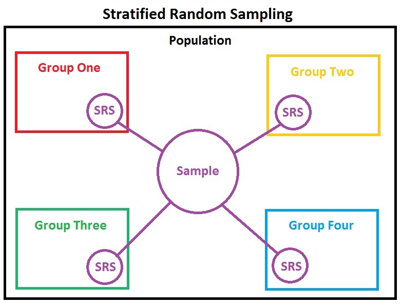
- divides population into more homogeneous subpopulations
- during design, strata are normally with predetermined probabilities
Stratification in analysis
- experimental blocks and population strata could either be treated as factors or strata for analysis
- stratification is necessary when you think a factor in a linear model is inadequate to capture differences between nuisance strata
- observations are:
- divided into strata
- strata are analyzed independently
- results are then averaged across strata