DESeq Workshop 1 - Standard Analyses for RNA-seq Data (unsupervised)
Abstract
This workshop summarizes the main approaches to analyzing sequencing data to obtain per-gene count data, but does not go through how to do it explicitly. It demonstrates approaches to summarizing count data using various Bioconductor annotation resources, followed by unsupervised exploratory data analysis. It introduces the (Ranged)SummarizedExperiment data class, variance-stabilizing transformations, and the use of distances to visualize transcriptome shifts through methods such as Principal Components Analysis and Multidimensional Scaling.
This workshop uses quotes and materials from RNA-seq workflow: gene-level exploratory analysis and differential expression by Love, Anders, Kim, and Huber.
This notebook is forked from two notebooks originally created by Levi Waldron, with modifications to the text and code performed by Andrew Leith. The The remaining material will be adapted into a second workshop on differential expression analysis with DESeq2 at a later date.
Outline
- Introduction to RNA-seq Data
- Initial Data Exploration
- Model Syntax
- Design Matrices
- Filtering
- Data Transformations
- log2
- rlog
- vst
- Transformation Visualization
- Boxplots
- Scatterplots
- Sample Heteogenity
- Heatmaps
- Component plots
- PCA plots
- MDS plots
Approaches to processing raw data: alignment vs. alignment-free methods
The computational analysis of an RNA-seq experiment begins from the FASTQ files that contain the nucleotide sequence of each read and a quality score at each position. These reads are either aligned to a reference genome or transcriptome, or the abundances and estimated counts per transcript can be estimated without alignment. For a paired-end experiment, the software will require both FASTQ files. The output of this alignment step is commonly stored in a file format called SAM/BAM.
RNA-seq aligners differ from DNA aligners in their ability to recognize intron-sized gaps that are spliced from transcripts, and their objective of counting transcripts. Baruzzo et al. 2017 provide a useful summary of software for aligning RNA-seq reads to a reference genome, and benchmark these using synthetic data for base-level and splice junction precision and recall, sensitivity to tuning parameters, and runtime performance. Some popular alignment-based tools include STAR, TopHat2, Subread, and Novoalign. de novo alignment does not use a reference genome: while it offers the possibility of discovering novel transcripts in rearranged genomes and genomes without good references, it requires more resources and manual effort and is less accurate for known transcripts, so for most people working with model organisms it is probably not a good option.
Alignment-free tools have gained popularity for their fast performance and low memory requirements while maintaining good accuracy. Instead of directly aligning RNA-seq reads to a reference genome, they perform "pseudo-alignment" by assigning reads to transcripts that contain compatible k-mers. The most popular of these tools are Salmon and Kallisto. These generate a table of read counts directly without the need for a SAM/BAM file as a starting or intermediate step.
You can easily perform RNA-seq alignment in R using Rsubread and GenomicAlignments, but the rest of this workshop assumes you are starting with the output of some sequence analysis pipeline (i.e. counts).
Annotating and importing expression counts
Measures of transcript abundance
The differential expression analyses introduced here assume you are analyzing a count table of Transcripts Per Million (TPM) or Counts Per Million (CPM) by samples. Note that while TPM and CPM would order the abundance of different transcripts very differently, for differential expression these differences are not as important. You should not use Fragments Per Kilobase per Million reads (FPKM) or otherwise normalize by library size / read depth. The negative binomial log-linear statistical model used by DESeq2 and edgeR are intended for use on count data, and achieve better performance than can be achieved with read depth-normalized data. Read depth-normalized data will introduce bias.
The SummarizedExperiment data class for representing RNA-seq data
The component parts of a SummarizedExperiment object.
assay(se)orassays(se)$countscontains the matrix of countscolData(se)may contain data about the columns, e.g. patients or biological unitsrowData(se)may contain data about the rows, e.g. genes or transcriptrowRanges(se)may contain genomic ranges for the genes/transcriptsmetadata(se)may contain information about the experiment
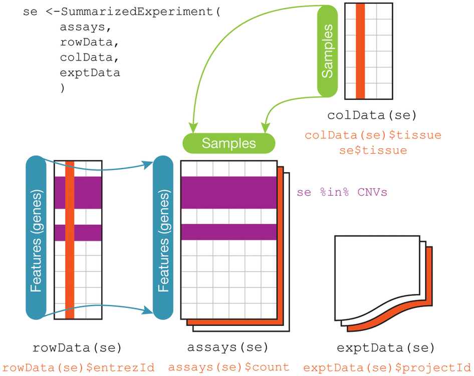
Note: The rowRanges could be a GRanges providing ranges of genes, or a GRangesList providing ranges of exons grouped by gene. Both are accessible from TxDb databases.
RangedSummarizedExperiment is a subclass of SummarizedExperiment, where the rowRanges is not empty. You can convert a SummarizedExperiment to a RangedSummarizedExperiment just by setting its rowRanges.
Some exploratory analysis of a demo RangedSummarizedExperiment:
suppressPackageStartupMessages({
    library(airway)
    library(SummarizedExperiment)
})
For the purposes of this tutorial, we will be using a default dataset that is part of R's airway package. The following command loads the airway dataset into our R environment:
data(airway)
airway
Characterizing the Dataset
Now, we will call some basic functions on this dataset to get a better sense of its fundamental characteristics, including dimensions, the number of counts present for each sample, and its structure:
dim(airway)
assayNames(airway)
head(assay(airway), 3)
colSums(assay(airway))
The rowRanges here is a GRangesList. The first gene has 17 exons:
rowRanges(airway)
The rowRanges object also contains information about the gene model in the metadata slot. Here we use a helpful R function, str, to display the metadata compactly:
str(metadata(rowRanges(airway)))
The colData:
colData(airway)
Exploratory data analysis
Standardization / transformation of count data for visual exploration
Features (e.g. genes) are typically "standardized", because:
- the differences in overall levels between features are often not due to biological effects but technical ones, e.g. GC bias, PCR amplification efficiency, ...
- otherwise a few very high-variance genes can dominate the distance, and make the distances less biologically relevant
Standardization traditionally meant converting to z-score:
$$x_{gi} \leftarrow \frac{(x_{gi} - \bar{x}_g)}{s_g}$$
But DESeq2 and edgeR provide their own RNA-seq specific standardization methods.
We will use standardization for the purposes of visualization below, but for statistical testing in the next period, we will go back to the original count data as required by the statistical procedures used.
Exploring the airway dataset
Once we have our fully annotated SummarizedExperiment object, we can construct a DESeqDataSet object from it that will then form the starting point of the analysis. We add an appropriate design for the analysis:
suppressPackageStartupMessages(library(DESeq2))
dds <- DESeqDataSet(airway, design = ~ cell + dex)
Of particular note is the model formula, which is passed as the design argument. Here, ~ cell + dex means that we are concerned with two covariates, cell and dex. ~ is how R denotes a model.
Model specification
- Many regression functions in R use a standard "model formula" syntax
- DEseq is a special case of regression that utilizes a negative binomial distribution
- The formula determines the model that will be built (and tested) by the R procedure. The basic format is:
> outcome (or response) variable ~ explanatory variables (or predictors)
- The tilde means "is modeled by" or "is modeled as a function of" - here, the left side of the model is implicit because DEseq is acting on a matrix of counts; these counts constitute the outcome/response, so no explicit specification of the response is required
Essential model formula syntax
| symbol | example | meaning |
|---|---|---|
| + | + x | include this variable |
| - | - x | delete this variable |
| : | x : z | include the interaction |
| * | x * z | include these variables and their interactions |
| ^ | (u + v + w)^3 | include these variables and all interactions up to three way* |
| 1 | -1 | intercept: delete the intercept |
* i.e. u + v + w + uv + uw + vw + uvw
Note: order generally doesn't matter (u+v OR v+u evaluate to the same mathematical model)
Examples: ~treatment, ~treatment + time, ~treatment * time
The Design Matrix
The Design Matrix
Use an example of a multiple linear regression model:
$y_i = \beta_0 + \beta_1 x_{1i} + \beta_2 x_{2i} + ... + \beta_p x_{pi} + \epsilon_i$
- $x_{ji}$ is the value of predictor $x_j$ for observation $i$
The Design Matrix
Matrix notation for the multiple linear regression model:
$$ \, \begin{pmatrix} Y_1\\ Y_2\\ \vdots\\ Y_N \end{pmatrix} = \begin{pmatrix} 1&x_1\\ 1&x_2\\ \vdots\\ 1&x_N \end{pmatrix} \begin{pmatrix} \beta_0\\ \beta_1 \end{pmatrix} + \begin{pmatrix} \varepsilon_1\\ \varepsilon_2\\ \vdots\\ \varepsilon_N \end{pmatrix} $$
or simply:
$$ \mathbf{Y}=\mathbf{X}\boldsymbol{\beta}+\boldsymbol{\varepsilon} $$
- The design matrix is $\mathbf{X}$
- which the computer will take as a given when solving for $\boldsymbol{\beta}$ by minimizing the sum of squares of residuals $\boldsymbol{\varepsilon}$.
There are multiple possible and reasonable design matrices for a given study design
- the model formula encodes a default model matrix, e.g.:
group <- factor( c(1, 1, 2, 2) )
model.matrix(~ group)
What if we forgot to code group as a factor, and instead left it as numeric?
group <- c(1, 1, 2, 2)
model.matrix(~ group)
The model matrix can represent multiple predictors, ie multiple (linear/log-linear/logistic) regression:
diet <- factor(c(1,1,1,1,2,2,2,2))
sex <- factor(c("f","f","m","m","f","f","m","m"))
model.matrix(~ diet + sex)
Why is f used as the default reference group instead of m? Because ASCII ordering (alphanumeric) is default.
More information on this topic can be found in Appendix A, which will be covered if time permits.
Filtering genes not satisfying a minimum expression threshold
Our count matrix contains many rows with only zeros, and additionally many rows with only a few fragments total. In order to reduce the size of the object, and to increase the speed of our functions, we can remove the rows that have no or nearly no information about the amount of gene expression (rows very close to zero but not exactly zero are likely artefacts / noise not indicative of actual gene expression). Here we apply the most minimal and conservative filtering rule: removing rows of the DESeqDataSet that have no counts, or only a single count across all samples. Additional weighting/filtering to improve power is applied at a later step in the workflow.
nrow(dds)
dds.original <- dds
dds <- dds[ rowSums(counts(dds)) > 1, ]
nrow(dds)
NB: only 46% of the genes remain after performing this filtering step, demonstrating the degree to which our performance will be improved by discarding the noninformative entries. A more stringent method of filtering, such as removing all genes that have any 0 count entries at all, would yield an even smaller percentage of genes.
head(as.data.frame(counts(dds)))
options(repr.plot.height=4, repr.plot.width=7)
par(mfrow=c(1,2))

plot(density(as.data.frame(counts(dds.original))$SRR1039508), xlim = c(0, 10000), ylim = c(0, .2), main = "Raw Densities", col = "Blue")
lines(density(as.data.frame(counts(dds.original))$SRR1039509), col = "Red")
lines(density(as.data.frame(counts(dds.original))$SRR1039512), col = "Green")
lines(density(as.data.frame(counts(dds.original))$SRR1039513), col = "Orange")
lines(density(as.data.frame(counts(dds.original))$SRR1039516), col = "Purple")
lines(density(as.data.frame(counts(dds.original))$SRR1039517), col = "Black")
lines(density(as.data.frame(counts(dds.original))$SRR1039520), col = "Yellow")
lines(density(as.data.frame(counts(dds.original))$SRR1039521), col = "Gray")

plot(density(as.data.frame(counts(dds))$SRR1039508), xlim = c(0, 2500), ylim = c(0, .01), main = "Filtered Densities", col = "Blue")
lines(density(as.data.frame(counts(dds))$SRR1039509), col = "Red")
lines(density(as.data.frame(counts(dds))$SRR1039512), col = "Green")
lines(density(as.data.frame(counts(dds))$SRR1039513), col = "Orange")
lines(density(as.data.frame(counts(dds))$SRR1039516), col = "Purple")
lines(density(as.data.frame(counts(dds))$SRR1039517), col = "Black")
lines(density(as.data.frame(counts(dds))$SRR1039520), col = "Yellow")
lines(density(as.data.frame(counts(dds))$SRR1039521), col = "Gray")

As we can see, the count densities before and after filtration are radically different, even with the raw densities portrayed over radically larger axis ranges. The reason for this divergence is that over 30,000 zero-count genes have shifted the density so that almost all of the area under the curve is near 0.
These 0-genes do not contribute meaningful information to our analysis (and can even bias some of our analytical techniques) so we remove them.
Note: For differential expression analysis later, filtering is
allowable but not necessary if using Independent Hypothesis Weighting,
as is the default behavior of DESeq2. Independent hypothesis weighting (IHW) is a multiple testing procedure that increases power compared to the method of Benjamini and Hochberg by assigning data-driven weights to each hypothesis.
Why is it Important to Transform Data Before Analysis?
The log, rlog, and variance stabilizing transformations
Many common statistical methods for exploratory analysis of multidimensional data, for example clustering and principal components analysis (PCA), work best for data that generally has the same range of variance at different ranges of the mean values. When the expected amount of variance is approximately the same across different mean values, the data is said to be homoskedastic. For RNA-seq counts, however, the expected variance grows with the mean. For example, if one performs PCA directly on a matrix of counts or normalized counts (e.g. correcting for differences in sequencing depth), the resulting plot typically depends mostly on the genes with highest counts because they show the largest absolute differences between samples. A simple and often used strategy to avoid this is to take the logarithm of the normalized count values plus a pseudocount of 1 (to account for 0-count observations, as the log of 0 is undefined and the log of 1 is always 0 irrespective of base); however, depending on the choice of pseudocount, the genes with the very lowest counts will contribute a great deal of noise to the resulting plot, because taking the logarithm of small counts actually inflates their variance. We can quickly show this property of counts with simulated data (here, Poisson-distributed counts with a range of lambda from 0.1 to 100). We plot the standard deviation of each row (genes) against the mean:
options(repr.plot.height=3, repr.plot.width=5)
lambda <- 10^seq(from = -1, to = 2, length = 1000)
cts <- matrix(rpois(1000*100, lambda), ncol = 100)
library(vsn)
meanSdPlot(cts, ranks = FALSE)

And for logarithm-transformed counts:
options(repr.plot.height=3, repr.plot.width=5)
log.cts.one <- log2(cts + 1)
meanSdPlot(log.cts.one, ranks = FALSE)

Note the markedly lower scale of the axes in the log-transformed data!
The logarithm with a small pseudocount (i.e. the standard log2(x+1) transformation) amplifies differences when the values are close to 0. The low count genes with low signal-to-noise ratio will then overly contribute to sample-sample distances and PCA plots.
As a solution, DESeq2 offers two transformations for count data that stabilize the variance across the mean: the regularized-logarithm transformation or rlog (Love, Huber, Anders, Genome Biology 2014), and the variance stabilizing transformation (VST) for negative binomial data with a dispersion-mean trend (Anders and Huber, Genome Biology 2010), implemented in the vst function.
For genes with high counts, the rlog and VST will give similar result to the ordinary log2 transformation of normalized counts. For genes with lower counts, however, the values are shrunken towards the genes' averages across all samples. The rlog-transformed or VST data then becomes approximately homoskedastic, and can be used directly for computing distances between samples, making PCA plots, or as input to downstream methods which perform best with homoskedastic data.
Which transformation to choose? The rlog tends to work well on
small datasets (n < 30), sometimes outperforming the VST when there is
a large range of sequencing depth across samples (an order of
magnitude difference). The VST is much faster to compute and is less
sensitive to high count outliers than the rlog. We therefore recommend
the VST for large datasets (hundreds of samples). You can perform both
transformations and compare the meanSdPlot or PCA plots generated,
as described below.
Note that the two transformations offered by DESeq2 are provided for applications other than differential testing. For differential testing we recommend the DESeq function applied to raw counts, as described in the next workshop on differential expression analysis; this approach also takes into account the dependence of the variance of counts on the mean value during the dispersion estimation step.
The function rlog returns an object based on the SummarizedExperiment
class that contains the rlog-transformed values in its assay slot. The assay slot is merely the piece of the dds object that contains the actual counts (as opposed to other information like metadata). R is programmed to know that when you call rlog on a dds object, and should transform the contents of the assay slot and not the entire object.
First, we will depict the untransformed data, against which we can visually compare the results of the two aforementioned transformations. Note the extreme outliers and leverage points in the upper right of the plot, each colored dark blue to show that only one gene falls within each point - these observations would cause a great deal of bias in the result if uncorrected:
suppressPackageStartupMessages(library(vsn))
options(repr.plot.height=3, repr.plot.width=5)
head(assay(dds), 3)
par(mfrow=c(1,2))
meanSdPlot(assay(dds), ranks=FALSE)

Now we will implement the rlog function:
options(repr.plot.height=3, repr.plot.width=5)
rld <- rlog(dds, blind = FALSE)
head(assay(rld), 3)
meanSdPlot(assay(rld), ranks=FALSE)

The function vst returns a similar object. Please note that the VST transformation is meant for exploratory data analysis and visualization only and is not to be used in actual differential expression analysis.
vsd <- vst(dds, blind = FALSE)
head(assay(vsd), 3)
meanSdPlot(assay(vsd), ranks=FALSE)

In the above function calls, we specified blind = FALSE, which means
that differences between cell lines and treatment (the variables in
the design) will not contribute to the expected variance-mean trend of
the experiment. The experimental design is not used directly in the
transformation, only in estimating the global amount of variability in
the counts. For a fully unsupervised transformation, one can set
blind = TRUE (which is the default).
To show the effect of the transformation, in the figure below
we plot the first sample
against the second, first simply using the log2 function (after adding
1, to avoid taking the log of zero, which as previously mentioned is undefined and would cause an error), and then using the rlog- and VST-transformed
values. For the log2 approach, we need to first estimate size factors to
account for sequencing depth, and then specify normalized=TRUE.
Sequencing depth correction is done automatically for the rlog
and the vst.
dds <- estimateSizeFactors(dds)
ddsESF <- estimateSizeFactors(dds)
df1 <- data.frame(log2(counts(ddsESF, normalized=TRUE)[, 1:2] + 1))
df1$transformation <- "log2(x + 1)"
df2 <- data.frame(assay(rld)[, 1:2])
df2$transformation <- "rld"
df3 <- data.frame(assay(vsd)[, 1:2])
df3$transformation <- "vsd"
df <- rbind(df1, df2, df3)
colnames(df)[1:2] <- c("x", "y")
head(df)
table(df$transformation)
options(repr.plot.width=6, repr.plot.height=2.5)
library(ggplot2)
ggplot(df, aes(x = x, y = y)) + geom_hex(bins = 80) +
  coord_fixed() + facet_grid( . ~ transformation)

Scatterplot of transformed counts from two samples. Shown are scatterplots using the log2 transform of normalized counts (left), using the rlog (middle), and using the VST (right). While the rlog is on roughly the same scale as the log2 counts, the VST has a upward shift for the smaller values. It is the differences between samples (deviation from y=x in these scatterplots) which will contribute to the distance calculations and the PCA plot.
We can see how genes with low counts (bottom left-hand corner) seem to be excessively variable on the ordinary logarithmic scale, while the rlog transform and VST compress differences for the low count genes for which the data provide little information about differential expression. As any differences in these low-count values are likely artefacts introduced by error or random chance, their exclusion helps to prevent false positives.
Boxplots of transformed distributions
Boxplots of the count distributions in each sample are a good way to understand the effects these transformations have at the level of individual subjects.
In R's boxplots, points classified as outliers are shown on the plots as circles. Here, neither the log2 nor the rld transformations include any outliers, while the vsd transformations do have outliers at the upper end of the distributions. These points are classified as outliers because the vsd method compresses lower end points more substantially, as can be seen on the scatter plot above - the actual magnitude of these points does not significantly exceed the magnitude seen with the other transformations.
par(mfrow=c(1,3))
boxplot(log2(assay(ddsESF)+1), las=2, main="log2(x+1)")
boxplot(assay(rld), las=2, main="rld")
boxplot(assay(vsd), las=2, main="vsd")

Sample distances
The importance of distances
High-dimensional data are complex and impossible to visualize in raw form. They represent thousands of dimensions, but we can only visualize 2-3.
All clustering and classification of samples and/or genes involves combining or identifying objects that are close or similar. Distances or similarities are mathematical representations of what we mean by close or similar. The choice of distance is important and varies for different subject areas and types of data.
See: http://master.bioconductor.org/help/course-materials/2002/Summer02Course/Distance/distance.pdf
Distances for exploratory RNA-seq data analysis
A useful first step in an RNA-seq analysis is often to assess overall similarity between samples: Which samples are similar to each other, which are different? Does this fit to the expectation from the experiment's design?
We use the R function dist to calculate the "Euclidean distance"
between samples; the Euclidean distance is simply the higher-dimensional analogue of the human-measurable distance between points in 2 or 3 dimensions. To ensure we have a roughly equal contribution from
all genes, we calculate it from the rlog-transformed data. We need to
transpose the matrix of values using t, because the dist function
expects the different samples to be rows of its argument, and
different dimensions (here, genes) to be columns.
sampleDists <- dist(t(assay(rld)))
sampleDists
We visualize the distances in a heatmap in a figure below, using the function
pheatmap from the pheatmap package.
library(pheatmap)
library(RColorBrewer)
In order to plot the sample distance matrix with the rows/columns
arranged by the distances in our distance matrix,
we manually provide sampleDists to the clustering_distance
argument of the pheatmap function.
Otherwise the pheatmap function would assume that the matrix contains
the data values themselves, and would calculate distances between the
rows/columns of the distance matrix, which is not desired.
We also manually specify a blue color palette using the
colorRampPalette function from the RColorBrewer package (this coloring step is optional and is determined by user preference).
options(repr.plot.height=3, repr.plot.width=5)
sampleDistMatrix <- as.matrix( sampleDists )
rownames(sampleDistMatrix) <- paste( rld$dex, rld$cell, sep = " - " )
colnames(sampleDistMatrix) <- NULL
colors <- colorRampPalette( rev(brewer.pal(9, "Blues")) )(255)
pheatmap(sampleDistMatrix,
         clustering_distance_rows = sampleDists,
         clustering_distance_cols = sampleDists,
         col = colors)

Heatmap of sample-to-sample distances using the rlog-transformed values.
Note that we have changed the row names of the distance matrix to contain treatment type and patient number instead of sample ID, so that we have all this information in view when looking at the heatmap.
Another option for calculating sample distances is to use the
Poisson Distance, implemented in the
PoiClaClu CRAN package.
This measure of dissimilarity between counts
also takes the inherent variance
structure of counts into consideration when calculating the distances
between samples. The PoissonDistance function takes the original
count matrix (not normalized) with samples as rows instead of columns,
so we need to transpose the counts in dds.
library(PoiClaClu)
poisd <- PoissonDistance(t(counts(ddsESF)))
We plot the heatmap below.
options(repr.plot.height=3, repr.plot.width=5)
samplePoisDistMatrix <- as.matrix( poisd$dd )
rownames(samplePoisDistMatrix) <- paste( rld$dex, rld$cell, sep=" - " )
colnames(samplePoisDistMatrix) <- NULL
pheatmap(samplePoisDistMatrix,
         clustering_distance_rows = poisd$dd,
         clustering_distance_cols = poisd$dd,
         col = colors)

Heatmap of sample-to-sample distances using the Poisson Distance.
PCA plot
Another way to visualize sample-to-sample distances is a principal components analysis (PCA). In this ordination method, the data points (here, the samples) are projected onto the 2D plane such that they spread out in the two directions that explain most of the differences (figure below). The x-axis is the direction that separates the data points the most. The values of the samples in this direction are written PC1 ("principal component 1"). The y-axis is a direction (it must be orthogonal - perpendicular - to the first direction) that separates the data the second most. The values of the samples in this direction are written PC2. The percent of the total variance that is contained in the direction is printed in the axis label. Note that these percentages do not add to 100%, because there are more dimensions - often many of them - that contain the remaining variance (although each of these remaining dimensions will by definition explain less than the two that we see).
colData(rld)
plotPCA(rld, intgroup = c("dex", "cell"))

PCA plot using the rlog-transformed values. Each unique combination of treatment and cell line is given its own color.
Here, we have used the function plotPCA() that comes with DESeq2.
The two terms specified by intgroup are the interesting groups for
labeling the samples; they tell the function to use them to choose
colors. We can also build the PCA plot from scratch using the
ggplot2 package.
This is done by asking the plotPCA() function
to return the data used for plotting rather than building the plot.
See the ggplot2 documentation
for more details on using ggplot().
pcaData <- plotPCA(rld, intgroup = c( "dex", "cell"), returnData = TRUE)
pcaData
percentVar <- round(100 * attr(pcaData, "percentVar"))
We can then use this structure to build up a second plot in a figure below, specifying that the color of the points should reflect dexamethasone treatment and the shape should reflect the cell line.
ggplot(pcaData, aes(x = PC1, y = PC2, color = dex, shape = cell)) +
  geom_point(size =3) +
  xlab(paste0("PC1: ", percentVar[1], "% variance")) +
  ylab(paste0("PC2: ", percentVar[2], "% variance")) +
  coord_fixed()

PCA plot using the rlog-transformed values with custom ggplot2 code. Here we specify cell line (plotting symbol) and dexamethasone treatment (color).
From the PCA plot, we see that the differences between cells (the
different plotting shapes) are considerable, though not stronger than the differences due to
treatment with dexamethasone (red vs blue color). This shows why it will be important to
account for this in differential testing by using a paired design
("paired", because each dex treated sample is paired with one
untreated sample from the same cell line). We are already set up for
this design by assigning the formula ~ cell + dex earlier when specifying our model.
MDS plot
Another plot, very similar to the PCA plot, can be made using the multidimensional scaling (MDS) function in base R. This is useful when we don't have a matrix of data, but only a matrix of distances. Here we compute the MDS for the distances calculated from the rlog transformed counts and plot these in a figure below.
This method, unlike PCA, does not show the percent of variance explained by the individual components.
MDS plot using rlog-transformed values.
mds <- cbind(as.data.frame(colData(rld)), cmdscale(sampleDistMatrix))
ggplot(mds, aes(x = `1`, y = `2`, color = dex, shape = cell)) +
  geom_point(size = 3) + coord_fixed()

In the figure below we show the same plot for the PoissonDistance. Note the difference in axis scale.
MDS plot using the Poisson Distance.
mdsPois <- cbind(as.data.frame(colData(ddsESF)),
   cmdscale(samplePoisDistMatrix))
ggplot(mdsPois, aes(x = `1`, y = `2`, color = dex, shape = cell)) +
  geom_point(size = 3) + coord_fixed()

PCA preserves the covariance of the data, while MDS preserves the distance between the data points. Depending on what type of distance you use for your MDS analysis, these two results can be the same (if Euclidean distance is used) or different. Here, we have used the Poisson distance (since it takes the structure of the variance into account), so the MDS and PCA results are not the same.
Appendices 
Appendix A
Interaction terms
Here is an example again of a single predictor, but with more groups
group <- factor(c(1,1,2,2,3,3))
model.matrix(~ group)
The baseline or reference group is the one that other groups are contrasted against. You can change the baseline group:
group <- factor(c(1,1,2,2,3,3))
group <- relevel(x=group, ref=3)
model.matrix(~ group)
Here, we demonstrate manually adding interaction terms:
model.matrix(~ diet + sex + diet:sex)
The result is the same as using the * operator:
model.matrix(~ diet * sex)
Appendix B
Additional options for mapping transcripts to genes
Option 1. Bioconductor TxDb.* packages, which are available for a number of model species (search for "TxDb" at https://bioconductor.org/packages/3.6/data/annotation/). These are slightly less convenient for this purpose than the Ensembl packages. For example, there is a TxDb package Mus Musculus from UCSC build mm10 based on the knownGene Track:
library(TxDb.Mmusculus.UCSC.mm10.knownGene)
txdb <- TxDb.Mmusculus.UCSC.mm10.knownGene
keytypes(txdb)
k <- keys(txdb, "TXNAME")
columns(txdb)
tx4gene <- select(txdb, keys=k, keytype="TXNAME", column="GENEID")
genes(txdb)
exonsBy(txdb)
Option 2. Find a TxDb from AnnotationHub
This opens up more annotation files from different sources. First find and choose a TxDb database:
suppressPackageStartupMessages(library(AnnotationHub))
ah <- AnnotationHub()
query(ah, "TxDb")
txdb <- ah[["AH52245"]] #TxDb.Athaliana.BioMart.plantsmart22.sqlite
Then use it to create the transcript-gene map:
keytypes(txdb)
columns(txdb)
k <- keys(txdb, "TXNAME")
tx5gene <- select(txdb, keys=k, keytype="TXNAME", column="GENEID")
head(tx5gene)
Option 3. Import a GFF annotation file from somewhere else.
To convert the GFF file these to a TxDb database, use the makeTxDbFromGFF() function from the GenomicFeatures package:
library(GenomicFeatures)
gffFile <- system.file("extdata", "GFF3_files", "a.gff3",
                       package="GenomicFeatures")
txdb <- makeTxDbFromGFF(file=gffFile,
            dataSource="partial gtf file for Tomatoes for testing",
            organism="Solanum lycopersicum")
keytypes(txdb)
columns(txdb)
k <- keys(txdb, "TXNAME")
tx6gene <- select(txdb, keys=k, keytype="TXNAME", column="GENEID")
head(tx5gene)
Note, the GenomicFeatures package enables you to make a TxDb from a variety of sources:
grep("makeTxDb", ls("package:GenomicFeatures"), val=TRUE)